The Corporate Website Taste Test…
Survey says: it’s official, Coke is better than Pepsi. Bowen Craggs & Co, “website effectiveness experts” have published an ‘Index of Corporate Website Effectiveness’ for 2008. Their aim, so they say, is to give an indication of how well corporate websites perform, given that corporates website are apt to gobble up the marketing budget without even being so polite as to clearly demonstrate their ROI.
An admirable aim, certainly. They claim to have developed a benchmarking methodology which looks at all aspects of the site’s performance, using expert analysts who take an average of ten hours to survey each site.
I’ll be honest, I’m a little dubious about this. ‘Effective’ is such a mammothly nebulous concept. Effective for who? For what? Surely to judge effectiveness, you need first to understand stated aims? Which is all well and good if it’s your own website and you know what your corporate requirements are, but not so easy to assess from the outside, I would have thought.
The most “effective” site of 2008
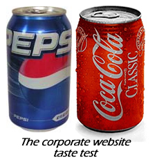
Aside from deciding the ‘taste test’ by placing Coca Cola at 10 and Pepsi way behind at 69, they rank Siemens as the most effective corporate website of 2008. I really have to wonder if we’re looking at the same site, though (if they provide a link to the site in question, I didn’t spot it). I must be in the wrong place, because the site I’m looking at has small, unattractive navigation which isn’t remotely where you’d expect to find it, while a good half the page is devoted to jumpy flash animation which changes jerkily while you mouse around. Okay, I’m not an ‘effectiveness expert’, but that really proves my point, which is that effectiveness depends quite a bit on who you are and what you’re looking for.
What really makes an effective corporate site?
Those interested in really good corporate websites, in my opinion, would do better to look at something like freelance designer Adrian Diaconescu’s list of 35 Professional Looking Corporate Websites. Adrian doesn’t have to define his terms, because it’s just a personal list, but even at first glance I can see why each of those sites would potentially perform well: they have clear and easy-to-use navigation, they don’t hit you in the face with unecessary flash, and perhaps most importantly, they steer you clearly and comfortably towards where they want you to go. There’s only one cardinal rule for corporate website design, in my opinion, and that’s Steve Krug’s “Don’t make me think”. Make your message clear, identify who will be visiting your corporate site and why, and then make it really easy for them to find what they came for.
Reading List
Bowen Craggs Survey
Steve Krug – Don’t Make Me Think