What you should put on your website (and what you shouldn’t)
I’ve been creating and working with websites for over a decade now. And one of the things that I always see people struggle with, is content. Companies will engage an agency to redevelop their website, and get really involved in the process. But when it comes to creating content, it can sometimes end up as a bit of an afterthought.
But what you put on your website matters. Obviously. It’s the story that you tell about your business and your products. It’s your best presentation piece. It’s one of your key sales tools. But there are a number of common pitfalls with website content, and most websites could do with a content tune-up. So here’s a quick guide to what you should put on your website (and equally, what you shouldn’t).
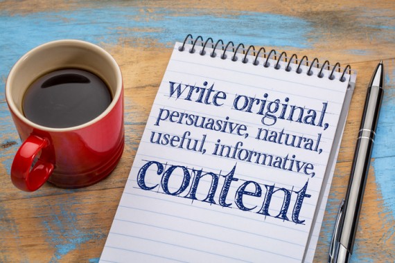
Words – but not too many.
I’m not telling you anything new when I say you’re going to need some copy. But the thing to be aware of here is that you need a lot fewer words than you think.
People don’t read much online. Studies have put the percentage of online content that people actually read at a lousy 20%. People are lazy, and people are busy. Nobody has time to read whole paragraphs, let alone whole pages.
And yet so often we see tons of copy on websites. Dense stacks of eye-wateringly dull text that nobody is ever going to read. But it’s there because heaven forbid we miss out some nugget of detail about our wonderful product or service.
It tends not to be quite so bad on homepages and landing pages. But so often we see a “content” page within a website as a blank slate for lots of words.
But writing for the web is different from writing for other channels. To be effective, you need to keep it short and simple. Rather than creating walls of text, create copy to be scanned. Use headings and subheadings and bulleted lists and pull-quotes to break up the text. This enables a visitor to take away some information with minimal effort.
Keep it simple, keep it authentic
And while we’re on the subject of writing for the web, take a minute to think about tone. Often when we write for business, we feel we need to be formal. I do it myself, unless I consciously try not to. We write in a stilted and long-winded way. We use the passive voice, we avoid using pronouns, and we let sentences run on and on. It’s a bad habit that results in dense, unwieldy sentences that are incredibly tough to understand.
Acme business corporation is a global leader in the design and manufacture of highly reliable widget solutions for a wide range of industries including communications, computing, automotive, healthcare, and defence. For over 150 years, customers have trusted Acme business corporation to help them maximise productivity with best-in-class, cost-effective advanced widget solutions.
What does any of this even mean? Compare that to the language used by a brand like Innocent smoothies.
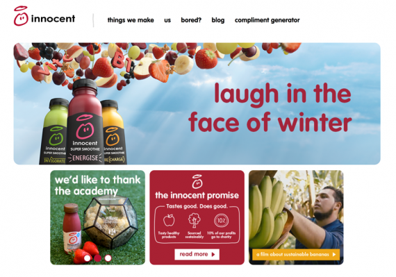
Have you ever read the side of an innocent smoothie bottle? If you have, you'll know that the important stuff they have to tell you is liberally broken up with some nice easy-going nonsense. And the innocent website uses the same relaxed, conversational tone throughout:
“Hello, we’re innocent …and we’re here to make it easy for people to do themselves some good (whilst making it taste nice too).”
Now, I’m not saying it's appropriate for every brand to adopt the highly conversational style favoured by B2C brands like innocent. But it is true to say that in developing your content, you need to find a voice that balances polished and professional with friendly and real.
- Be concise. Don’t be tempted to waffle.
- Don’t write walls of text – break it up with headings, subheadings & bulleted lists
- Try not to be too formal
- Write short, simple sentences & short paragraphs.
- Use pronouns to talk about 'you' and 'us'.
- Use the language your visitors use
- If you wouldn’t enjoy reading it – don’t write it!
By the way, there’s a great tool you can use to improve the quality of your copy. It’s called the Hemingway app, and it highlights every time you’ve used stilted language, or been long-winded. And it grades the content on readability. It’s a bit of an eye-opener, and I recommend bookmarking it.
...you need to find a voice that balances polished and professional with friendly and real.
So, keep it simple, relatively informal, and above all, short. And lastly, remember to break it up with some images. Which brings us to our next item for discussion – images.
Images
You absolutely need to use images in your content. Images break up the text, and reduce the cognitive burden on the reader. We all enjoy reading things more if there are a few pictures scattered about.

But at this point most people head over to the stock libraries, and that’s where the trouble starts. Why? Because one of the things your website visitors are looking for is authenticity. It's something everyone is looking for. Your audience want to feel that there's something real, something solid, behind your website. And cheesy stock photos do nothing to build that sense of authenticity. So how do you avoid the pitfalls and choose better images for your website?
Lesson number one – be willing to spend time on choosing images. If you are too literal in your search, or do it without a little thought and imagination, you'll end up with stilted and predictable image choices: aka clichés. Your images don't always have to reflect exactly what you're talking about on the page. Could you go with something more conceptual? Use images that reflect the applications of your product or service, rather than the service itself? Choosing images that resonate with your audience is important here, to - what will they identify with?
Lesson two – choose good quality images. It should go without saying, but spend a little bit of time to find something that actually looks good on the page. There are many places you can go to look for decent, high-res, uncliched imagery to support your content. Unsplash is one, Find a Photo is another. A lot of them are free. And if you really can’t find anything on any of the sites above that fit the bill, you could try this list of nearly 100 image resources.
Lesson three – for premium content like a landing page, consider a bespoke visual. Custom illustrations are a great way to create a visual which is completely unique and engaging. They add value to the content on the page. And they're also much more interesting than yet another stock image.
- Use images to break up copy
- You don’t need to be literal in your image choices, & your images don’t have to be “on message”.
- Choose nice images
- For key pages, consider commissioning bespoke visuals or infographics
Social proof
I probably need to get out more, but I love the fact that how we interact with websites is driven by the same psychological triggers as the rest of human behaviour. And a great case in point is social proof. Social proof – and by that I mean feedback from other people – is arguably the biggest single influencer of human behaviour. Human beings are social creatures. We like to think we're special and unique; but in reality we know that there's safety in numbers. Which means that we instinctively look to others, to help guide our decisions. Whether its online or offline, we take advice and recommendations. And we like to feel that those are genuine and not driven by any ulterior motives or hidden agendas.
So what does that mean for your website? Well, if your website isn’t using social proof to reassure visitors about the quality of your products/services, then you’re missing a trick. Testimonials and social comment allow people to place their trust in you, knowing that they’re not the first to do so. A testimonial won't make the difference between a sale and no sale. But having social proof on your website is vitally important to establish that all-important credibility in the minds of your audience.
- Find a place for testimonials, comment and feedback on your website.
Video
I have to confess, I’m not a watcher of video myself, and I think that tends to make me underestimate its value. But for a lot of website users video is now a critical part of their online experience, and not just for entertainment. The stats for video consumption as part of the B2B buying process make a compelling case for putting video content on your website.
95% of IT decision makers watch tech-related videos for business purposes.
A 2024 survey on the "Role and Influence of the Technology Decision Maker" had this to say: A massive 95% of B2B tech decision-makers in the US watched videos as part of their buying journey, or 96% in EMEA. Video absolutely should be part of your content strategy.

Try to de-clutter
This last item is more about what you don’t put on your website than what you do. One of the things that's frequently specified when we design a new website is “clean and uncluttered”. But unfortunately, like everything else in life, websites attract clutter. We’ve already talked about the temptation to tell people everything on your website. Then on top of that things change in the business and you need to add new information to your website. But rarely is anything ever taken off a website. And new things aren’t ‘designed in’ so much as plonked in wherever they – sort of - fit. So you end up with clutter.
If you have cluttered pages, what you’ve got there is visual noise. It’s distracting and annoying to the visitor, and may well cause them to click off.
- Check your website for cluttered pages, and remove content that isn’t adding anything
Lastly - get the quick guide
Want the cliff notes? Why not download our one-page PDF guide to creating effective website content? We won't ask for your details in return - just click the button and it'll download the PDF straight to you.