Reduced vertical resolution – on web design, netbooks and tablets
Dammit. Why is it that just when we’d got to the stage when you could reasonably expect most of your viewing audience have monitors of a decent size (goodbye 800 x 600, so long, we shan’t miss you)… they go and release these pesky netbooks?
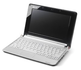 While they’re undoubtedly very nice portable bits of kit (I want one), they do have the disadvantage of causing the whole screen resolution/monitor size thing to raise its ugly head again. The situation was brought to my attention this week by a client viewing a new site build on his Asus Eee PC with a 10” screen. As far as he is concerned, the width is fine and the machine is so portable that you’ll put up with having to do a lot of scrolling. But with sales of netbooks estimated to have topped the 18 million mark last year – according to the Consumer Electronics Association – are we going to have to review the way we design?
Well, as with the case of my client, many of the netbooks have quite a decent screen width. Most have a 1024 by 600 resolution – and many of our corporate website designs sit around the 960px width mark, so no need to worry there. What we might need to consider, though, is what sits ‘above the fold’ (i.e. what is visible without scrolling).
Of course, the other problem with these little darlings is their more limited processing power and memory. Not being as bright as their big brothers, netbooks can struggle to run a lot of client side stuff, so loading websites with flash and other rich media presentations could start to be a problem, too.
As all designers know, you can’t please all of the people all of the time, in terms of screen resolution or anything else for that matter – but with smaller form-factor devices on the rise and rise we do need to keep them in mind when we roll out new site designs.