Five common website errors that annoy your visitors
 Does your website feature any of these things that annoy the majority of people? Here are five of the most basic usability sins - the issues you might have on your website that annoy your visitors, and make them reach for the back button..
Sin #1: No clear information on what your site is about
Visitors arriving at a site decide within seconds whether they’re going to stay or leave, so the first rule of usability is to make your message clear enough and easy enough to understand that no-one leaves before they’ve taken a look around.
Sin #2: Making things difficult to find
Whatever your site visitor is going to need – whether it’s a login box, a search function, a particular product or a way to contact you, it should be easy to find. You might think it’s clever to put the search box in a slidy-out section which can be accessed by clicking on the magnifying glass icon, but the chances are your users won’t. To a certain extent this relates to user expectation, which in turn means doing things the way everyone else does them. Studies have shown that users have a pre-conceived idea of where to find certain objects, and that when those objects are where they expect them to be, the user is more likely to be satisfied with the site. Or to put it another way – it’s like supermarkets – all supermarkets follow the same approximate layout for the same reason: if people can’t find what they’re looking for, they get annoyed and leave.
Sin #3: No calls to action
If there are things you want your user to do when they get to your website – and there surely are, otherwise what’s the point of having the site in the first place? – then you need to make that clear. A visitor arrives at a website with certain expectations, but they are also ready to be led. Your whole design and layout should be based around leading visitors clearly and easily to whatever it is you want them to see or do.
Sin #4: Too much text
The way your page is laid out is critical in making visiting your site an easy, pleasant experience. Too much content crammed in, with no visual clues as to what’s what and what’s important creates visual noise – the website equivalent of a dozen voices, all yelling at once for your visitor’s attention. Over-use of flash, too many adverts, insufficient white-space, flashing gifs and dense text all fall into this category. Make life easier for your visitor by providing well written copy which is easy to scan, having a few points of focus which are clearly the most important, and accompanying all aspects with a descriptive heading, and maybe an image or an icon too, if that makes things clearer.
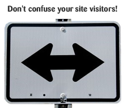
Sin #5: Inconsistent behaviour
Sin #5: Inconsistent behaviour. Consistency is king. Consistency lets your visitor understand your site and where they are in it. Consistent navigation, consistent styling, with navigational clues, consistent emphasis, consistent language. Your navigation should be the same on every page – preferably with an ‘on’ state marker or a breadcrumb to show where you are in the site; your links should all look the same, and your terminology should remain the same throughout.
Conclusion
There are hundreds of ways to get it wrong with usability, but it all boils down to “will this confuse my visitor, make their life more difficult or waste their time?”
It all boils down to “will this confuse my visitor, make their life more difficult or waste their time?”
I’m a website user too, and I have a number of pet hates which will drive me away from a site – overly long forms, three level navs that slide away under your mouse, search functions that clearly don’t work, obvious things hidden under unusual names, links that don’t look like links, and sites that don’t work in particular browsers are all things which drive me mad and are guaranteed to drive other people mad too. But with a bit of extra thought, sites can be designed so that your visitor never even needs to think – and that’s what we’re aiming for.